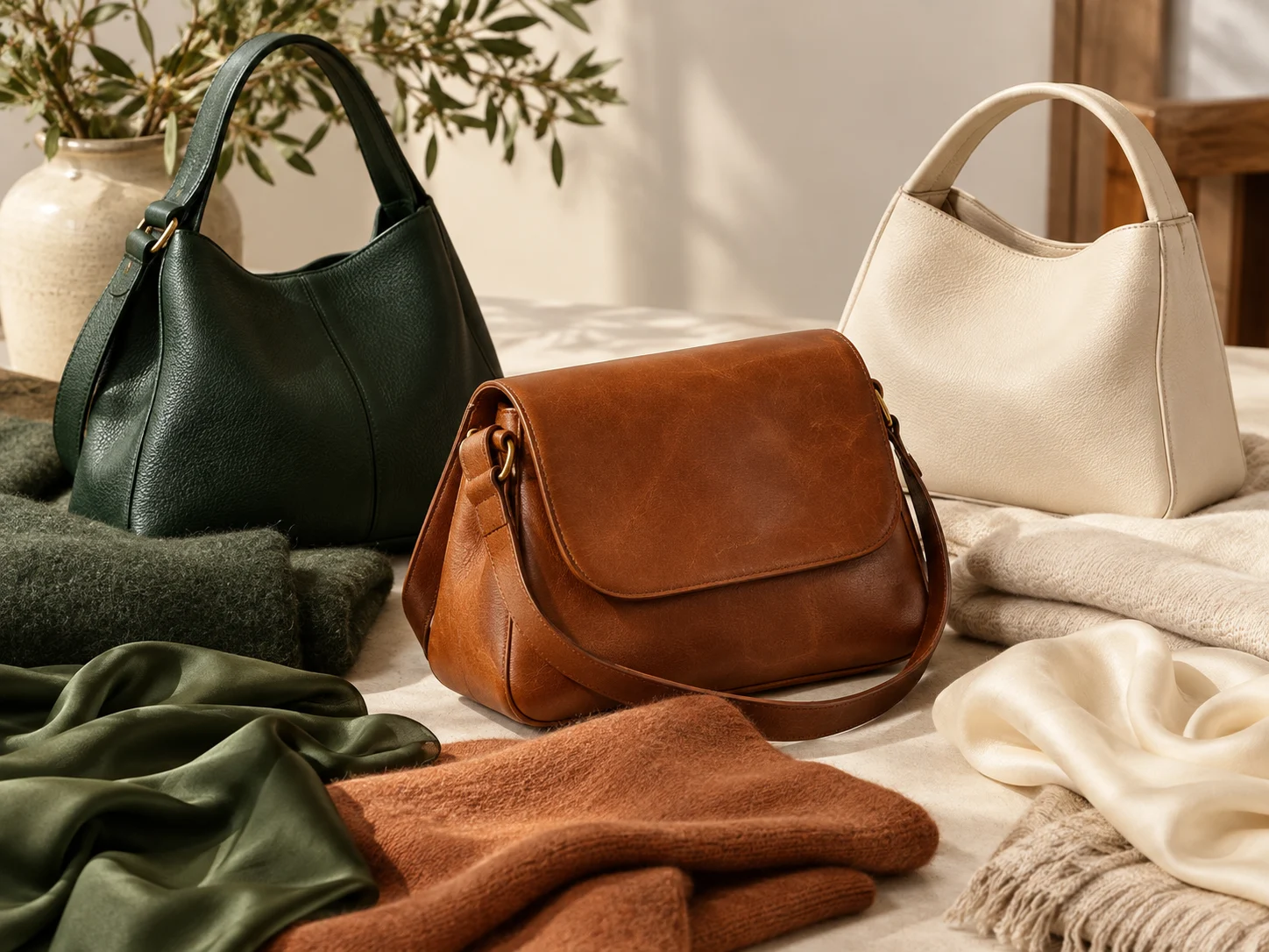
La couleur la plus utile est celle qui se répète naturellement à travers les vêtements et les chaussures que vous portez déjà.
La réponse rapide
La couleur de sac à main la plus polyvalente n'est pas automatiquement noire, beige ou brune. C'est la couleur qui se connecte avec les neutres, chaussures, vêtements de dessus et tons métalliques que vous portez déjà. Commencez par examiner deux semaines de tenues réelles et d'identifier les couleurs qui apparaissent le plus souvent. Choisissez un sac qui se marie avec ces couleurs ou crée un contraste répétable délibéré. Considérez ensuite l'entretien : les teintes très pâles montrent un transfert de colorant et des marques, tandis que les surfaces brillantes très foncées peuvent montrer de la poussière ou des rayures. Un premier sac quotidien utile a généralement un contraste moyen, matériel compatible et une couleur que vous pouvez porter en plusieurs saisons sans planifier toute la tenue autour.
Auditer votre garde-robe au lieu de deviner
Ouvrez votre garde-robe et identifiez les couleurs que vous portez réellement, pas les couleurs que vous comptez porter. Grouper les vêtements en neutres dominants, couleurs secondaires et accents occasionnels. Les neutres dominants peuvent inclure le noir, la marine, le gris, la crème, le chameau, l'olive ou le denim. Comptez aussi les chaussures et les vêtements de dessus, car un sac à main est souvent assis à côté d'un manteau et se connecte visuellement avec des chaussures plus qu'avec un haut caché.
Photographiez dix tenues récentes ou examinez des photos sur votre téléphone. Remarquez des combinaisons répétées. Si la plupart des tenues contiennent du gris frais, du noir et du bleu, un sac neutre frais peut s'intégrer facilement. Si votre garde-robe se penche vers la crème, le bronzage, la rouille et le vert chaud, un brun chaud ou une nuance terreuse mutée peut se sentir plus naturel. La preuve de tenues réelles empêche d'acheter une couleur théoriquement polyvalente qui quitte rarement l'étagère.
Décider si le sac doit se fondre ou contraster
Une couleur de mélange crée un look continu et plus silencieux. Un sac noir avec des vêtements d'extérieur sombres ou un sac à chameau avec des neutres chauds devient une partie de la tenue plutôt que son point focal. Cela peut rendre un sac de travail plus grand semble moins dominant. Une couleur contrastée rend le sac plus visible et peut énergiser les vêtements simples, mais il exige aussi une coordination plus délibérée.
Le contraste ne concerne pas seulement la lumière contre l'obscurité. Une bourgogne muette peut contraster avec la marine tout en se sentant retenue. Un sac à crème pâle peut créer un fort contraste avec le noir même si les deux sont neutres. Décidez si vous voulez que le sac disparaisse dans des tenues quotidiennes, les cadrer clairement ou agir comme un accent reconnaissable. Ce choix réduit la recherche de couleur plus efficacement que les listes de tendances.
Le contraste change la taille, la forme ou la position dominante visuelle d'un sac.
Comparer noir, marron, beige et autres neutres
Noir est facile à répéter dans de nombreuses armoires et semble souvent défini, mais il peut se sentir lourd avec des vêtements pâles très doux. Brun foncé fonctionne bien avec des armoires chaudes et mélangées et peut montrer le bord porter moins fortement que certaines finitions noires. Le bronzage moyen est flexible avec du denim, de la crème, de l'olive et des couleurs chaudes, bien que les bronzages oranges puissent entrer en conflit avec les gris frais. Beige et crème peuvent éclairer une tenue mais nécessitent plus d'attention au transfert et au stockage.
Le gris, le taupe, la marine et l'olive sont des alternatives utiles. Taupe bridges couleurs chaudes et fraîches lorsque le sous-ton est équilibré. La marine peut fonctionner comme un neutre foncé plus doux pour les armoires construites autour du denim, blanc et gris. Olive peut se comporter comme un neutre à côté des tons terrestres et noirs. Comparer l'ombre exacte dans la lumière naturelle; les noms de couleurs larges masquent de grandes différences dans le ton et la saturation.
Utilisez le sous-ton pour faire coopérer les couleurs
Deux bruns peuvent se comporter différemment parce qu'un est rouge, un jaune et un gris. Il en va de même pour le beige, le blanc et le gris. Placez la couleur du sac à côté de votre manteau, chaussures et pantalons les plus utilisés en plein jour. Les sous-tons chauds se connectent souvent avec la crème, le chameau, la rouille et les détails dorés. Les sous-tons frais se connectent souvent avec des détails blancs, gris-bleu, noir et argenté. Les garde-robes mixtes peuvent utiliser des nuances muettes et à faible saturation comme un pont.
Une correspondance exacte n'est pas requise. En fait, un match de tête à orteil peut regarder trop planifié. Le but est la relation visuelle : chaleur répétée, profondeur ou douceur. Le matériel contribue à cette relation. Le matériel doré peut renforcer les couleurs chaudes, tandis que le matériel argenté peut renforcer les couleurs fraîches, mais les métaux mélangés sont normaux. Choisissez le matériel qui ne vous fait pas éviter le sac avec vos bijoux quotidiens.
Choisissez une couleur d'accent que vous pouvez répéter
Un sac d'accent est le plus utile quand sa couleur apparaît déjà quelque part dans votre vie. Il peut faire écho à une écharpe, détail de sneaker, famille de rouge à lèvres, étui téléphonique ou d'impression. La répétition n'a pas besoin d'être exacte; un sac vert profond peut se rapporter à plusieurs verts mutés. Choisissez une famille de couleurs qui semble bien à côté d'au moins trois de vos principaux neutres. Cela crée plusieurs chemins de tenue au lieu d'un match parfait.
Des couleurs très saturées attirent l'attention et peuvent rendre un petit sac important. Les accents mutés tels que bourgogne, vert forêt, bleu poussiéreux ou terre cuite sont souvent plus faciles à répéter. Considérez comment la couleur ressemble à la lumière artificielle du soir ainsi que le jour. Un accent destiné aux événements devrait encore fonctionner avec les manteaux et les chaussures portés sur le chemin.
Une couleur d'accent est plus facile à répéter quand elle se rapporte à une famille de couleurs de garde-robe existante.
Considérez la taille, la texture et la finition
La couleur apparaît différemment selon les matériaux. Le cuir lisse brillant reflète la lumière et peut rendre l'aspect sombre plus net. Grain, daim et surfaces tissées absorbent la lumière et adoucissent la même couleur. Le quilting crée des reflets et des ombres. Un très grand sac lumineux a plus d'impact visuel qu'un petit sac à la même nuance. Équilibrez l'intensité de la couleur avec la taille et la structure du sac.
La texture peut également étendre la polyvalence. Un sac mat foncé peut travailler de façon décontractée et professionnelle, tandis qu'une finition haut de gamme peut se sentir plus formelle. Les surfaces imprimées ou monogrammes se comportent comme des motifs plutôt qu'une seule couleur; identifiez leur fond, contraste et échelle. Voir les photos de gros plan et de complet-outfit parce qu'une texture qui semble subtile dans le détail peut devenir dominante sur l'ensemble du sac.
Plan pour l'entretien et le transfert de couleur
Les couleurs claires peuvent prendre la teinture du denim foncé, des manteaux et des sièges de véhicule, en particulier avec le frottement et l'humidité. Les couleurs très foncées peuvent être transférées sur des vêtements pâles lorsque la finition ou le textile est instable. Les pigments lumineux peuvent se faner avec un soleil prolongé. Aucune couleur n'est sans entretien, donc correspondez au choix de votre routine. Un sac quotidien de navette touche plus de surfaces qu'un sac occasionnel.
Avant l'utilisation, garder le sac à l'écart des textiles instables sombres et tester le contact avec précaution de façon discrète, le cas échéant. Conservez-le dans une housse respirante à l'abri de la lumière directe et du papier coloré. N'utilisez pas de nettoyants sévères dans une tentative de préserver une couleur pâle. La prévention contrôlée et l'attention douce et rapide sont plus sûres que le nettoyage agressif répété.
Construisez une stratégie de couleur à deux sacs
Quand un sac ne peut pas couvrir toutes les routines, pensez par paires. Un neutre plus foncé ou moyen peut gérer des déplacements fréquents et un temps incertain. Un accent neutre ou contrôlé plus léger peut ajouter du contraste pour les week-ends et les événements. Les deux sacs ne devraient pas résoudre le même problème de tenue. La taille, la couleur et le style de transport différents créent une couverture plus utile que deux neutres presque identiques.
Enregistrer les captures d'écran des couleurs du candidat à côté des photos de vos tenues communes. Éliminer toute ombre qui nécessite l'achat de nouvelles chaussures ou vêtements de dessus pour qu'il fonctionne. La bonne couleur devrait réduire les décisions, pas créer plus. Choisissez l'ombre que vous pouvez imaginer transporter la semaine prochaine avec des vêtements déjà dans votre garde-robe, puis confirmez le matériau et les dimensions séparément.
Foire aux questions
Le noir est-il toujours la couleur de premier sac à main la plus sûre ?
Le noir est utile dans de nombreuses armoires, mais la marine, le taupe, le brun ou l'olive peuvent mieux s'intégrer lorsque vos vêtements sont plus doux, plus chauds ou surtout denim.
Un sac à main devrait-il correspondre exactement aux chaussures ?
C'est pas vrai. La profondeur, la tonalité ou l'humeur globale sont généralement suffisantes. L'appariement exact est facultatif plutôt qu'une règle.
Quelles couleurs de sac montrent le moins d'usure ?
Les couleurs texturées de valeur moyenne déguisent souvent les poussières mineures et la variation mieux que les finitions très pâles ou très foncées, mais le matériau compte.
Un sac à main lumineux peut-il encore être polyvalent?
Oui, quand la couleur fonctionne à côté de plusieurs neutrons de garde-robe et apparaît ailleurs dans vos accessoires ou vêtements.
Guides connexes
Sacs structurés vs Slouchy
Choisir un sac de travail pratique raffiné
Guides pour sacs à main
Besoin d'aide pour comparer un article?
Examiner les mesures, les matériaux et l'utilisation prévue avant de commander. Pour des questions spécifiques au produit, contactez le support ORBUYBAG et demandez des photos claires, des dimensions et une courte vidéo de détail.
Conseils révisés : vérifiez la pièce, le devis et les conditions du service avant tout achat.